Hammad Mir logo UI/UX and Product Designer
Sankalp Taru logo whiteTree icon
Sankalp Taru Featured image
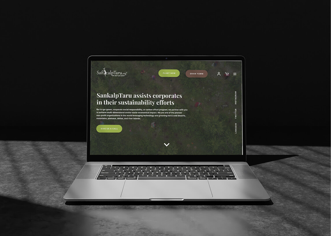
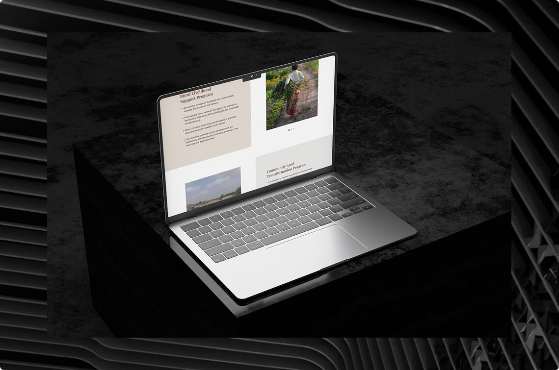
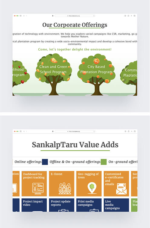
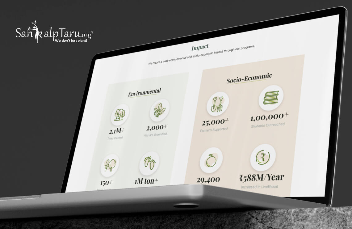
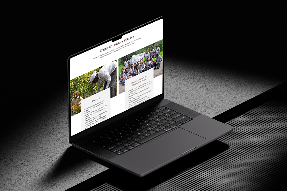
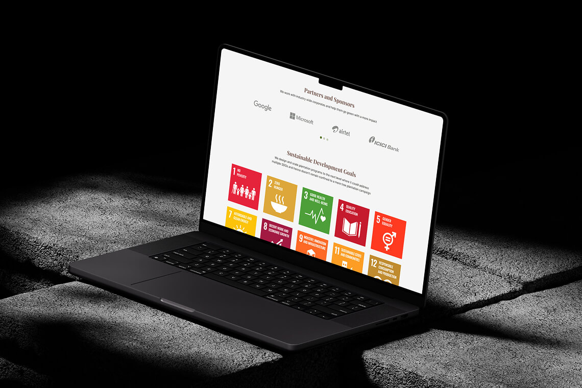
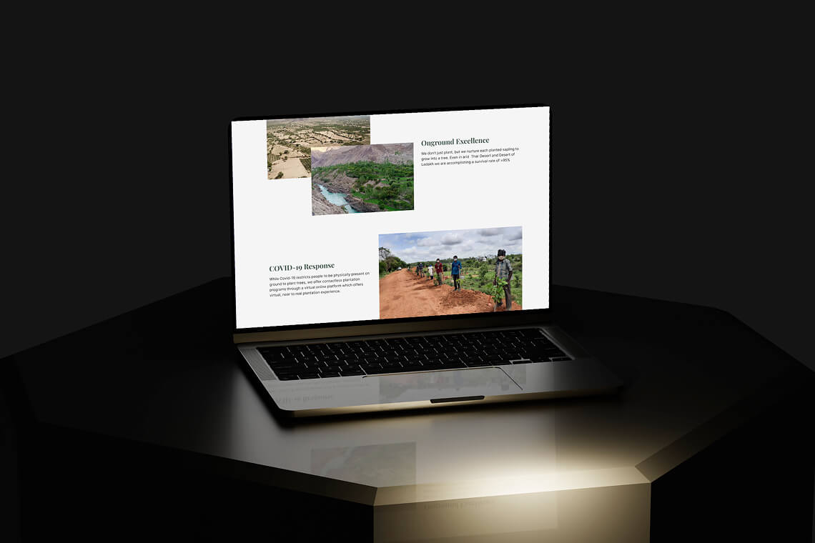
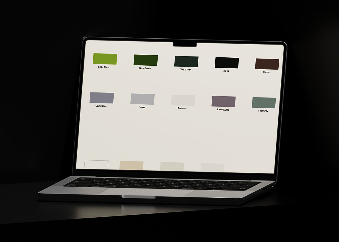
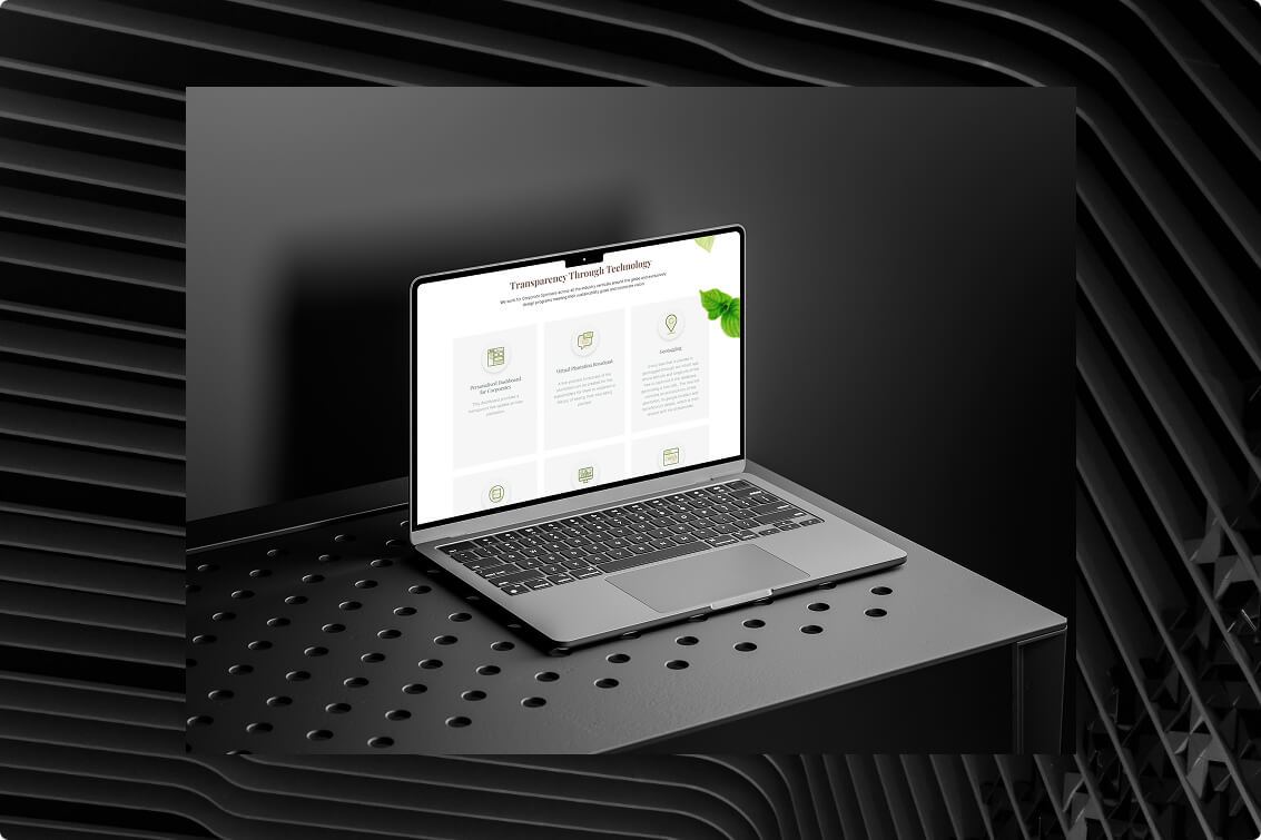
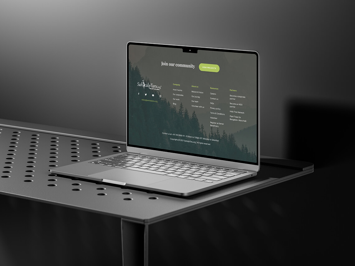
SankalpTaru is an NGO doing amazing work in environmental sustainability. They needed a website redesign that reflected their impact, streamlined donations, and helped users explore and contribute more easily. I led the UX/UI overhaul, helped them simplify the experience, tell a stronger story, and create a platform that works for both hearts and minds.
Sankalp Taru 2nd fold
Old site widget
The Challenge
  1. Sankalp Taru, a non-profit dedicated to sustainable development and environmental preservation, needed a modern and engaging landing page.

  2. Their existing page (on left) was outdated and needed revamp to effectively communicate ST’s inspiring mission and vision.

  3. The challenge was to design a visually compelling and user-friendly experience that would inform, inspire action, and establish a strong brand identity.

  4. The redesign also had to set the foundation for the rest of the website, allowing ST’s in-house team to continue the transformation seamlessly.
Sankalp Taru Impact screen
The Solution
  1. Created a visually engaging and strategically structured landing page that captured ST’s mission and encouraged participation.
  2. Developed a new brand identity, including a nature-inspired colour palette symbolising growth, vitality, and sustainability.
  3. Selected organic yet modern typography to reinforce ST’s commitment to environmental harmony.
  4. Designed an intuitive layout that guided visitors through ST’s mission, projects, and ways to get involved.
  5. Balanced modern aesthetics with organic elements, fostering a deep connection between the audience and nature.
  6. Ensured the design was flexible and scalable, enabling ST’s in-house team to extend the same creative vision across the website.
Sankalp Taru Corporate Programme screen
Sankalp Taru SponsorsSankalp Taru Excellence section
Tree icon
Research & Planning
  • Started by diving deep into user journeys and SankalpTaru’s mission.
  • Analysed top user actions: donating, sponsoring, tracking impact.
  • Reviewed competitors and non-profit UX best practices.
  • Simplified the structure to highlight key CTA points.
  • Focused on trust signals: real stories, partner logos, and impact visuals.
Key Features I designed and their Results
  1. Earthy colour palette and clean typography.
  2. Consistent iconography and illustration style.
  3. Improved image hierarchy and white space for better readability.
  4. Increased engagement and participation due to an intuitive, visually appealing design.
  5. Stronger emotional connection with visitors through nature-inspired branding.
  6. Broader audience reach, inspiring more people to take part in environmental initiatives.
  7. Established a solid design foundation for future website development.
Sankalp Taru Typography
Sankalp Taru Colours
Sankalp Taru tech section
Sankalp Taru Footer
The Results
  1. The redesigned landing page effectively communicated ST’s mission, fostering a sense of environmental responsibility.

  2. Visitors felt a stronger connection to the cause, leading to greater engagement and involvement in ST’s projects.

  3. The fresh visual identity and seamless experience made sustainability efforts more accessible and inspiring.

  4. The project helped ST expand its reach and drive meaningful environmental action.
Hammad Mir logo UI/UX and Product Designer

UI/UX & Product designer helping early stage SaaS startups with their MVP and small business going digital.

© 2025 Hammad Mir

Visit my LinkedIn profileVisit my Insagram profileVisit my Dribbble profile